Moiré - what is it and how to get rid of it?
|
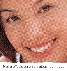
What do you get when you scan printed pictures in magazines, brochures and the like? You get unsightly cross-hatch patterns in your scanned images, and sometimes, depending on your scanner, you may also get ugly yellowish streaks across your image. These are moiré patterns.
Why do you get them? Printed images, unlike photographs, are actually made up of thousands of tiny coloured dots. When viewed from a sufficient distance, these dots merge into one another and fool the eye into seeing continuous colour. Unfortunately, the pattern of these dots (also known as half-tones) interfere with your scanner, and it results in the moiré patterns in your scanned images. Moiré effects also vary, depending on the quality of the printing and the type of paper involved.
So now we know what moiré is, how do we get rid of it? Well, you can start off by choosing your source material carefully. Thick, glossy paper produces the least moiré effects. Thinner paper such as those found in weekly magazines are more problematic. The printing isn't particularly sharp or of high resolution in the first place, and due to the thinness of the paper, you also have to contend with the print that shows up from the other side of the page. If you're scanning from a newspaper, good luck. If you're scanning from printed works, you can't completely get rid of moiré, but you can reduce its effects so that it doesn't become noticeable. Here's one method which works well for me. It is specific to Photoshop, but the general principles can be applied to any photo-editing program.
Note: remember to save the file in the native Photoshop file format.
Scan your image at as high a resolution as possible. I usually do it at 300 dpi.
Call up each individual colour channel (CTRL-1, CTRL-2 & CTRL-3) and run the despeckle filter once on each colour channel.
Resample down your image using the image size function. In essence, you try to reduce and smooth out the moiré patterns in your image by making it smaller.
For an A4 or letter-sized image (the typical size of a
magazine page), you resample the image by specifying the length to 8 inches or smaller.
Make sure the resample image and constrain proportions options are
checked. 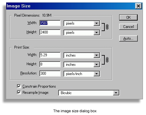 That way when you
specify a new length, the width of the image will be automatically adjusted to maintain
the proper proportion. Do not adjust the dpi resolution at this stage - leave it at 300
dpi. Save your image at this point.
That way when you
specify a new length, the width of the image will be automatically adjusted to maintain
the proper proportion. Do not adjust the dpi resolution at this stage - leave it at 300
dpi. Save your image at this point.
Take a good look at your resampled image to see if the moiré patterns are still visible. Go through each colour channel (red, green & blue) to identify the channel with the worst problem. (The blue channel is usually the worst culprit). Run the despeckle filter again on the affected channel. Save your image again at this point.
After you have touched up your image (Cropping, colour adjustment and the like), apply the unsharpen filter several times to sharpen up you image. It's best to run the filter several times at a small figure (like the default value of 50%), rather than just once at a larger figure. That way you can control how your image will look. Save your image.
If you're displaying your image on the web, resample your image down to 75 or 85 dpi, and apply the unsharpen filter again as needed to sharpen up your image. Save the file, and remember to save it under a different file name! That way you have 2 files: one low-resolution image for display on the web, and another high-resolution image for use if you want to edit your image again.
Points to note:
Do not apply the despeckle filter more than 2 times consecutively on any colour channel. It may get rid of the moiré, but it also rubs out detail, resulting in fuzzy images.
Equipment | Memory | Resolution | Calibration | Moire | Quick Masks | File Formats
 |